The new YouTube application is on the iPhone only so far, but seems likely that it will be on the iPad soon. The new interface looks very much like your typical YouTube experience.
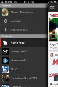
When you go in, the view looks extremely different with the new feed view as the default. As stated by the experts from 1kviews, what is really interesting is the new sidebar navigation that is included into the design whereby the old YouTube application had the navigation bar down the bottom. Its very much like the Facebook sidebar – in fact it appears to be almost a perfect copy. Either way, its a great navigational tool so a definite thumbs up there for me on this new part of the interface.
The new navigation gives a lot more parts to play with, its feature rich. The thumbnails of the videos are a lot larger to start with which makes it easier to interact with and determine if you would like to view the content.
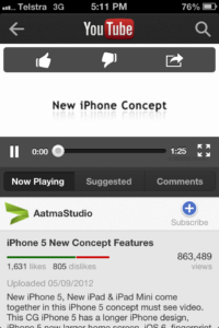
Upon selecting a new video, the old one used to immediately open the video to full screen. The new one however opens it into a smaller screen mode allowing you to view the additional content such as comments and suggestions. This is actually a much richer experience and brings the ‘sociability’ of the application to the iPhone experience which is what makes YouTube so popular. Of course there is the option to make the video larger when playing, or you can continue to watch it in the smaller size.
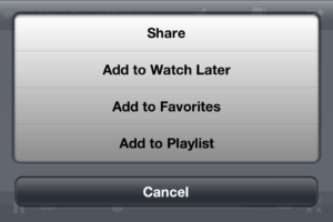
The features surrounding the video are great – including the ‘watch later’. Watch later is fantastic -especially if you want to watch something when you want to watch it at you own convenience. I can see people creating their own play lists for playing later on the train such as music etc…
The search function is available almost everywhere, and like all good usability – its in a consistent position every time. This is a definite combination of both the Apple and Google experience. Great intuitive user interfaces. Miles ahead of Microsoft today.
Adding to the sidebar are your subscribed channels which lets you go through can view. Selecting the channel brings the list of videos – which again is very accessible, interactive and easy to read. You can add channels here as well.
Categories are viewable on the sidebar. These work in the same format as the subscribed channels. The experience is the same however there are certainly more categories than I knew existed. In terms of relaxed browsing – I certainly started to wander through more videos than I would normally have done. So from YouTube’s point – there are going to be more videos watched.
If a Safari channel is seen in Safari – then the new YouTube app will be what opens so the full integration experience is inherent in the new design. Unfortunately, there are going to be advertisements. This was not in the old version – but to be honest – with the way mobile is moving, this was predictable. Its all going mobile so Google had to find somewhere to get the advertisements viewed on mobile devices (and one wonders what cut Apple is getting from this).
At this stage, it would seem that the iPad version would get a similar experience. Although, the iPad version through a browser is quite a good one and offers the chance to view high definition videos ~ so who knows what is next


