The cost of bad design was something I spoke about recently, and suggested that it was time we started recognising that there is a cost of getting it wrong. There are however ways to push for good design and you can read more here about the possible ways to improve on design although its not possible to measure in a finite way.
Dieter Rams was a German industrial designer who worked for companies like Braun and Vitsœ and was highly awarded during his years. He was a strong believer in the ‘less is more’ school of thought yet he started to feel that design was starting to fall apart in the 1980’s so he created the 10 Principles of Good Design. These principles have become widely respected and well recognised in the design community but they apply to digital as strongly as any other design discipline.
The principles will help to review the design process and strive for continuous improvement, they are not laws and there are always exceptions, but if the design component of the project strives to make design achieve these principles, then the outcome should be something pretty spectacular.
Good Design is Innovative
The possibilities for progression are not, by any means, exhausted. Technological development is always offering new opportunities for original designs. But imaginative design always develops in tandem with improving technology, and can never be an end in itself.
Possibly one of the biggest holes digital folk can fall in to is the assumption that anything that happens in the digital world is innovative. The principle here then becomes all the more important as there is never too much innovation. Its always important to consider, has the newest (and most appropriate of course) technology been taken advantage of. Its bad design if there is technology, function or form that does not serve a purpose but there is so much opportunity within the digital realm to take advantage of some of the later improvements. Innovation in design also allows for future improvements and gains. The rate of change introduced in smartphones, web technologies and devices is so rapid that the design needs to allow for those future enhancements to be developed into the design.
The Rise alarm clock application includes a design that is simple, but very different from what you might expect. Its a simple alarm clock application but the interface truly does go outside what is expected to be the norm for the way a user interacts with their device and application
Makes a Product Useful
A product is bought to be used. It has to satisfy not only functional, but also psychological and aesthetic criteria. Good design emphasizes the usefulness of a product whilst disregarding anything that could detract from it.
Dieter’s principle here is a simple one. The product, or application is bought for a purpose. When a user visits a website, there is a purpose. They have in mind something that they want to acheive and this has commenced that process. Their purpose will be some form of function be it research, purchasing or some kind if interaction with respect to your products or services and quite simply, the design must serve that purpose.
Too many applications try to put far too much function, designs and features into a single screen or the application itself. The application or website can not be all things at once. Design uses a function called ‘layering’ which groups together like functions and slowly reveals new ones as the user progresses through their journey.
The easier and clearer the functions are to the end user, the more likely they will be to utilise that application. Some of the simplest applications developed on Apple’s iPhones have been fundamentally simple ones. A quick photo and a location to remind a user where they have parked their car and the time they are due back (if they are parked next to a meter) was developed in Melbourne by a young teenager. Its so unbelievably simplistic in its design, but it was useful and easy for the user to grasp.
Is Aesthetic
The aesthetic quality of a product is integral to its usefulness because products are used every day and have an effect on people and their well-being. Only well-executed objects can be beautiful.
The overall design of the iPhone has not changed since it was first introduced nearl 6 years ago. A simple rectangular shape with curved corners and a single button on the face of it. While is has grown larger and certainly slimmer in its years the overall design gas not changed. Apple fans marvel over this design and have done so since it was first introduced and why not, its elegant, simple, functional and well executed. So much so that it has had many imitate and borrow from the same design from the body right through to the operating system.
Makes a product understandable
It clarifies the product’s structure. Better still, it can make the product clearly express its function by making use of the user’s intuition. At best, it is self-explanatory.
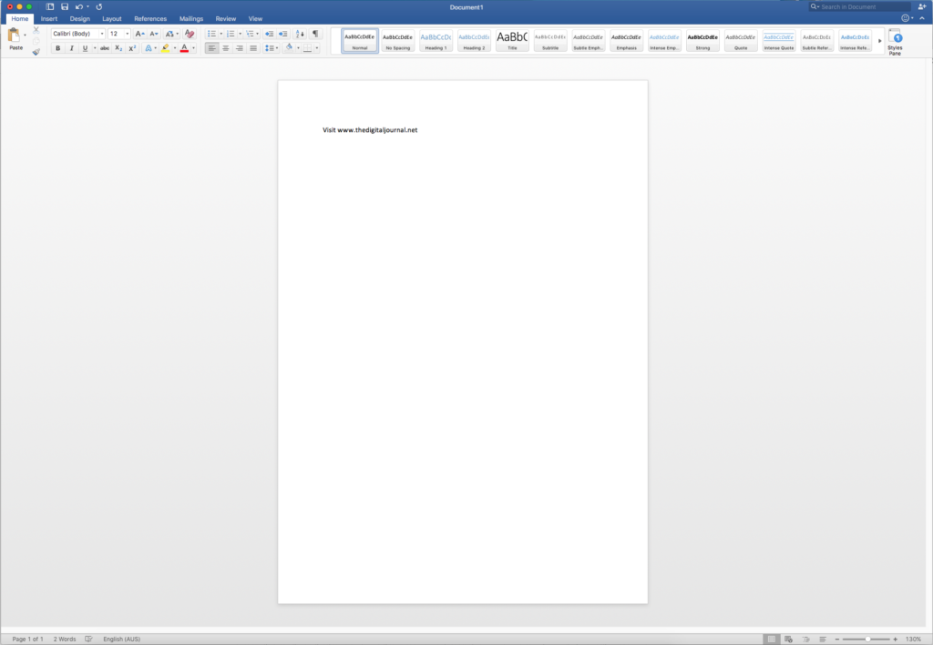
If you need to give too much instruction, then the designer has not done their job properly. Good design will provide hints, it will provide intuitive elements, but the user will ultimately be able to work their way through the product without excessive instruction. Take the Microsoft Word interface, while one of the most powerful word processors today, its simple approach which has remained consistent since its first introduction, requires little research and training for an average user to open up and start creating documents. Even the more bolder functions are easily found and used making document creation a task that is not a scary one at all. Its easy to understand why it is the most popular word processor today and is likely to remain so for some time.
Is Unobtrusive
Products fulfilling a purpose are like tools. They are neither decorative objects nor works of art. Their design should therefore be both neutral and restrained, to leave room for the user’s self-expression.
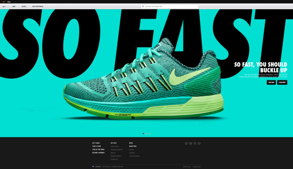
This is a principle that can have many exceptions, but it is certainly a good starting point. since it helped a lot for many people Let me explain, some designs be they websites, applications or even games are purposed to drive a set of emotions. Video games for example are purposely designed to immerse the user in the world of the game. Its hard to spend time on a game like Grand Theft Auto and not become immersed in the world that has been created. Take the Nike website which is often a site that has been created to inspire a lifestyle. These types of designs fly directly in the face of being unobtrusive and literally push their design on the end user. But that is ok, they can get away with that as it fits well within their brands.
Is Honest
It does not make a product appear more innovative, powerful or valuable than it really is. It does not attempt to manipulate the consumer with promises that cannot be kept.
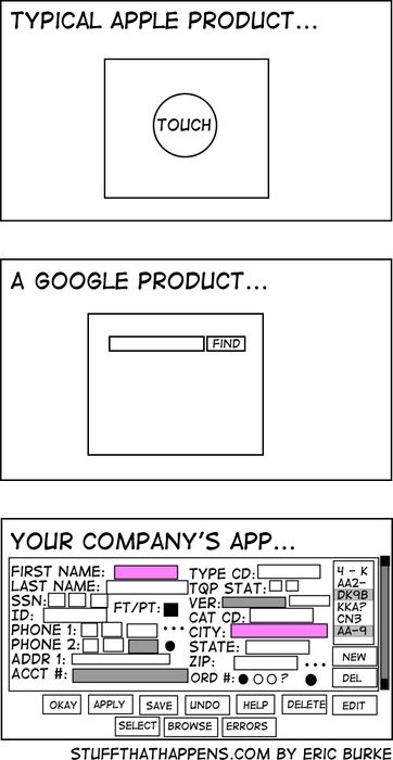
A classic meme identifies the vast differences between two design approaches often considered the most innovative and elegant. The truth is that these designs do not make them appear anything more than the simple function they provide to the user. They do not extend themselves to do much more than offer the basic reason that the organisation is there for. One of the most significant mistakes that is seen today in website and applications development is the organisation that desires to implement all their offerings, products and services in the same application catering for any possible situation. What results is the most annoying and often intimidating user experience that inevitably results in driving the user away.
Is Long-lasting
It avoids being fashionable and therefore never appears antiquated. Unlike fashionable design, it lasts many years – even in today’s throwaway society.
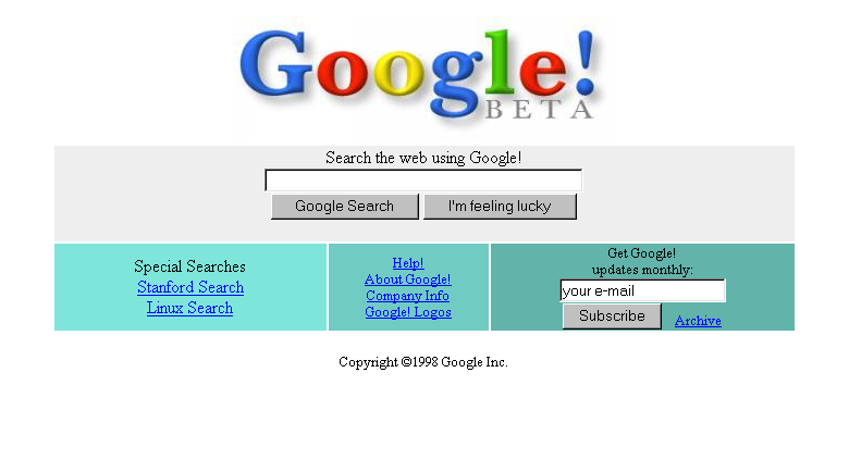
I’m going to rely on the previous image again as funny as that one can be, its just so relevant. Those designs, especially Google, simply have not changed over time. They have remained with the same features and overall information architecture for many years. There is a lesson to be learned in that approach and too many companies now are seeking a redesign every year or so to remain fresh.
Is thorough, down to the last detail
Nothing must be arbitrary or left to chance. Care and accuracy in the design process show respect towards the consumer.
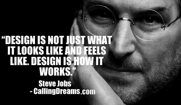
Steve Jobs will most likely be remembered throughout history as many things. One of them that sticks out however will be his meticulous, and many say “fanatical” approach to design right down to the detail. As Steve Jobs said, its not just what you see but its how it works as well. Design should not just be a passing over by the “pretty committee”, it needs detailed review and refinement of processes, behaviors and the principles that are being applied. While it might have been simple for Google to simple place a search function at the face of the organization. There is a lot of work to create the user experience and the doorway that follows that page when a user clicks to search for something.
Is environmentally friendly
Design makes an important contribution to the preservation of the environment. It conserves resources and minimizes physical and visual pollution throughout the lifecycle of the product.
While many people think about environmentally friendly being all about eco-systems, protection of the environment and the like. Good design in digital can be environmentally friendly. Designed simple and elegant means that the systems supporting the application are not working as hard. If the systems are not working as hard, or even the requirements of the underlying system are efficient then that means less wear and tear on the environment through reduced energy to support it. Think also on the printing functions. I’ve been to too many websites that look great, but hitting that print button means you tear down a couple of trees and burn through an inkjet cartridge on the first page. Thats bad…
There is an importance to develop your design and content strategy hand in hand to ensure that this principle is met. Design must take into consideration a few of the following tips:
- During briefing stages, identify the most important to the least important items of the development so these can be accommodated with eco preferences where possible.
- Intend to have the piece designed for extended use or reuse wherever possible. For example, a promotional flyer designed in December could include a yearly fridge calendar on the back to be used all year-round. Be creative in your approach.
- When designing for print, avoid page bleeds where possible. Printing with bleed creates off-cuts that need to go through a de-inking process during recycling.
- Avoid creating design that uses a lot of ink coverage and design in black and white when possible.
- Consider using ‘low-ink’ fonts for large areas of body text.
Is as little design as possible
Less, but better – because it concentrates on the essential aspects, and the products are not burdened with non-essentials. Back to purity, back to simplicity.
After all this, it seems that this principle is at odds with the rest of them. But the truth of this one is that there is a lot of work that goes in to design, and even more when the desire is to make it look like there has been no design. More and more websites, applications and interfaces are taking the notes from successful brands such as Google, Microsoft and Apple and adopting the ‘less is more’ approach. Its best to consider that with all the design work, the best outcomes will be produced by studying the numbers, analysing the experiences and applying design to make these as quick and simple as possible. The answer is not to plunge large groups of designers into the mix and design for the sake of designing and churning out a process that becomes over-complicated and caters for every possible nuance that can be conceived.
Remember – less really is more, even if you put a lot of work into it….

