The post 10 Principles of Good Design in Digital appeared first on The Digital Journal.
]]>Dieter Rams was a German industrial designer who worked for companies like Braun and Vitsœ and was highly awarded during his years. He was a strong believer in the ‘less is more’ school of thought yet he started to feel that design was starting to fall apart in the 1980’s so he created the 10 Principles of Good Design. These principles have become widely respected and well recognised in the design community but they apply to digital as strongly as any other design discipline.
The principles will help to review the design process and strive for continuous improvement, they are not laws and there are always exceptions, but if the design component of the project strives to make design achieve these principles, then the outcome should be something pretty spectacular.
Good Design is Innovative
The possibilities for progression are not, by any means, exhausted. Technological development is always offering new opportunities for original designs. But imaginative design always develops in tandem with improving technology, and can never be an end in itself.
Possibly one of the biggest holes digital folk can fall in to is the assumption that anything that happens in the digital world is innovative. The principle here then becomes all the more important as there is never too much innovation. Its always important to consider, has the newest (and most appropriate of course) technology been taken advantage of. Its bad design if there is technology, function or form that does not serve a purpose but there is so much opportunity within the digital realm to take advantage of some of the later improvements. Innovation in design also allows for future improvements and gains. The rate of change introduced in smartphones, web technologies and devices is so rapid that the design needs to allow for those future enhancements to be developed into the design.
The Rise alarm clock application includes a design that is simple, but very different from what you might expect. Its a simple alarm clock application but the interface truly does go outside what is expected to be the norm for the way a user interacts with their device and application
Makes a Product Useful
A product is bought to be used. It has to satisfy not only functional, but also psychological and aesthetic criteria. Good design emphasizes the usefulness of a product whilst disregarding anything that could detract from it.
Dieter’s principle here is a simple one. The product, or application is bought for a purpose. When a user visits a website, there is a purpose. They have in mind something that they want to acheive and this has commenced that process. Their purpose will be some form of function be it research, purchasing or some kind if interaction with respect to your products or services and quite simply, the design must serve that purpose.
Too many applications try to put far too much function, designs and features into a single screen or the application itself. The application or website can not be all things at once. Design uses a function called ‘layering’ which groups together like functions and slowly reveals new ones as the user progresses through their journey.
The easier and clearer the functions are to the end user, the more likely they will be to utilise that application. Some of the simplest applications developed on Apple’s iPhones have been fundamentally simple ones. A quick photo and a location to remind a user where they have parked their car and the time they are due back (if they are parked next to a meter) was developed in Melbourne by a young teenager. Its so unbelievably simplistic in its design, but it was useful and easy for the user to grasp.
Is Aesthetic
The aesthetic quality of a product is integral to its usefulness because products are used every day and have an effect on people and their well-being. Only well-executed objects can be beautiful.
The overall design of the iPhone has not changed since it was first introduced nearl 6 years ago. A simple rectangular shape with curved corners and a single button on the face of it. While is has grown larger and certainly slimmer in its years the overall design gas not changed. Apple fans marvel over this design and have done so since it was first introduced and why not, its elegant, simple, functional and well executed. So much so that it has had many imitate and borrow from the same design from the body right through to the operating system.
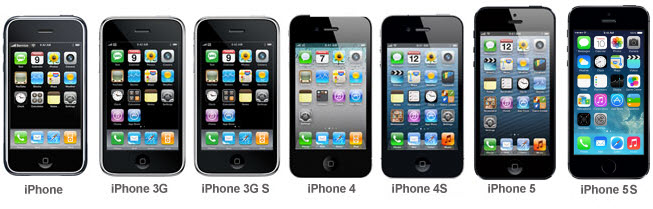
iPhone design progression
Makes a product understandable
It clarifies the product’s structure. Better still, it can make the product clearly express its function by making use of the user’s intuition. At best, it is self-explanatory.
If you need to give too much instruction, then the designer has not done their job properly. Good design will provide hints, it will provide intuitive elements, but the user will ultimately be able to work their way through the product without excessive instruction. Take the Microsoft Word interface, while one of the most powerful word processors today, its simple approach which has remained consistent since its first introduction, requires little research and training for an average user to open up and start creating documents. Even the more bolder functions are easily found and used making document creation a task that is not a scary one at all. Its easy to understand why it is the most popular word processor today and is likely to remain so for some time.
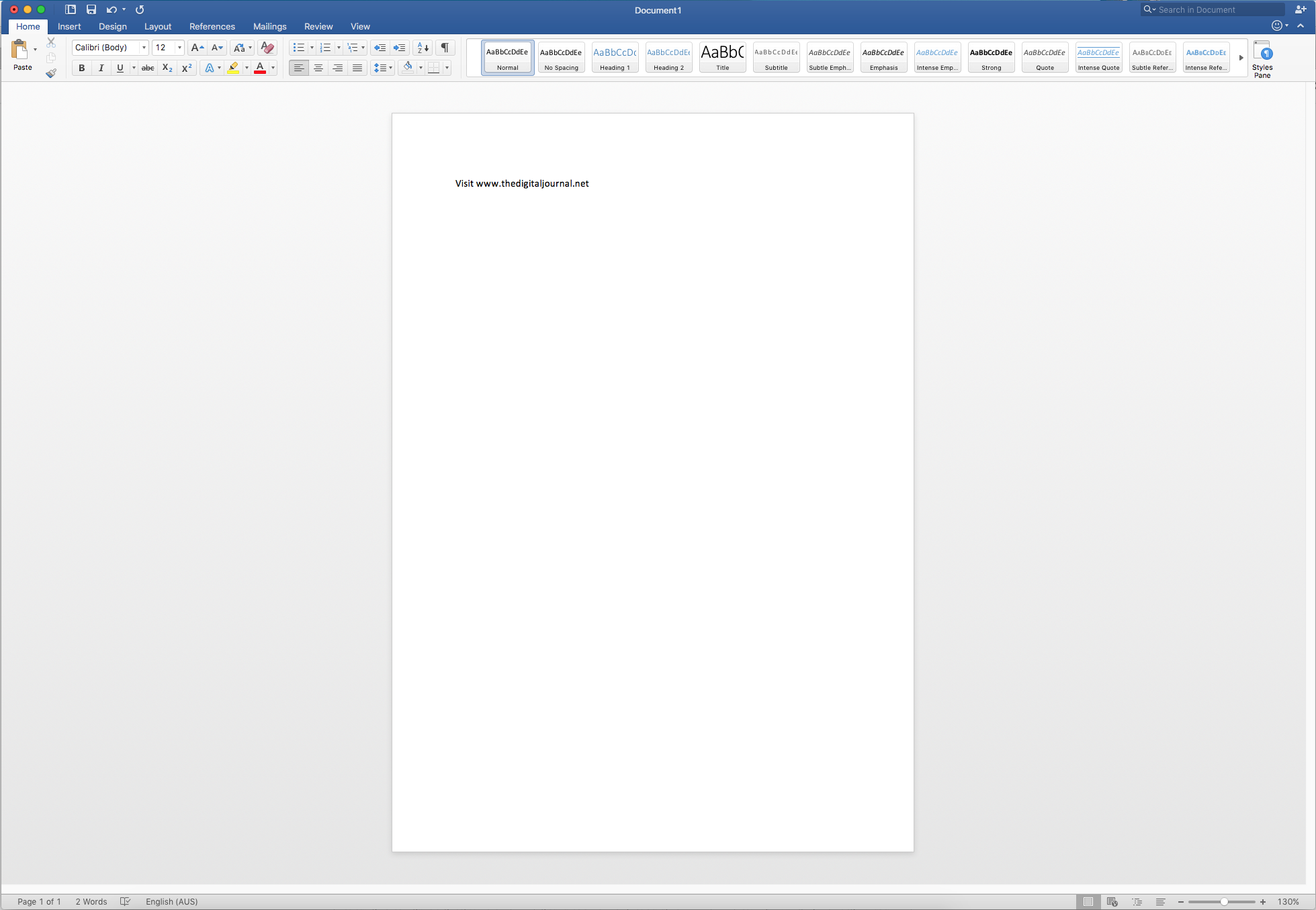
Microsoft Word 2016 Interface
Is Unobtrusive
Products fulfilling a purpose are like tools. They are neither decorative objects nor works of art. Their design should therefore be both neutral and restrained, to leave room for the user’s self-expression.
This is a principle that can have many exceptions, but it is certainly a good starting point. since it helped a lot for many people Let me explain, some designs be they websites, applications or even games are purposed to drive a set of emotions. Video games for example are purposely designed to immerse the user in the world of the game. Its hard to spend time on a game like Grand Theft Auto and not become immersed in the world that has been created. Take the Nike website which is often a site that has been created to inspire a lifestyle. These types of designs fly directly in the face of being unobtrusive and literally push their design on the end user. But that is ok, they can get away with that as it fits well within their brands.
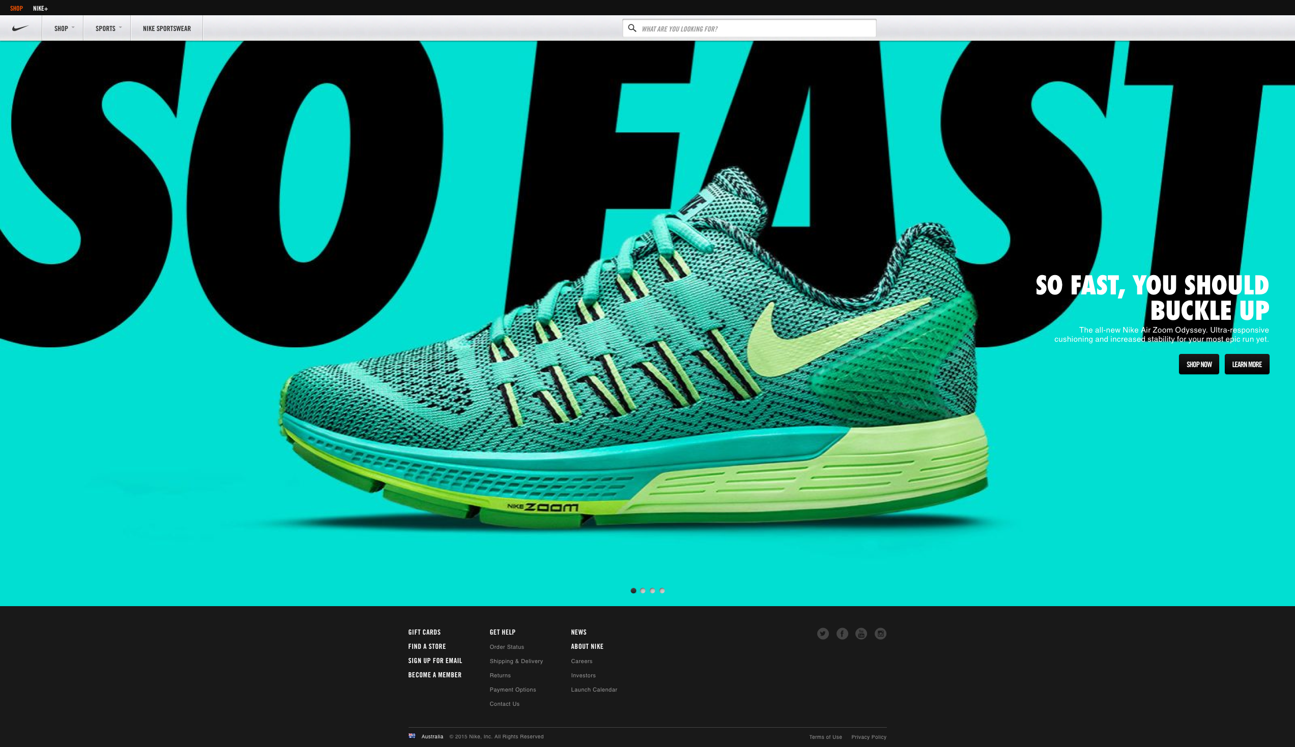
Nike Website
Is Honest
It does not make a product appear more innovative, powerful or valuable than it really is. It does not attempt to manipulate the consumer with promises that cannot be kept.
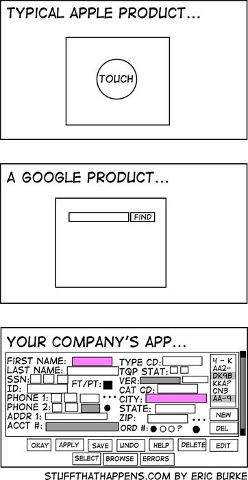
A classic meme identifies the vast differences between two design approaches often considered the most innovative and elegant. The truth is that these designs do not make them appear anything more than the simple function they provide to the user. They do not extend themselves to do much more than offer the basic reason that the organisation is there for. One of the most significant mistakes that is seen today in website and applications development is the organisation that desires to implement all their offerings, products and services in the same application catering for any possible situation. What results is the most annoying and often intimidating user experience that inevitably results in driving the user away.
Is Long-lasting
It avoids being fashionable and therefore never appears antiquated. Unlike fashionable design, it lasts many years – even in today’s throwaway society.
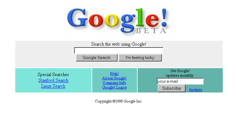
I’m going to rely on the previous image again as funny as that one can be, its just so relevant. Those designs, especially Google, simply have not changed over time. They have remained with the same features and overall information architecture for many years. There is a lesson to be learned in that approach and too many companies now are seeking a redesign every year or so to remain fresh.
Is thorough, down to the last detail
Nothing must be arbitrary or left to chance. Care and accuracy in the design process show respect towards the consumer.
Steve Jobs will most likely be remembered throughout history as many things. One of them that sticks out however will be his meticulous, and many say “fanatical” approach to design right down to the detail. As Steve Jobs said, its not just what you see but its how it works as well. Design should not just be a passing over by the “pretty committee”, it needs detailed review and refinement of processes, behaviors and the principles that are being applied. While it might have been simple for Google to simple place a search function at the face of the organization. There is a lot of work to create the user experience and the doorway that follows that page when a user clicks to search for something.
Is environmentally friendly
Design makes an important contribution to the preservation of the environment. It conserves resources and minimizes physical and visual pollution throughout the lifecycle of the product.
While many people think about environmentally friendly being all about eco-systems, protection of the environment and the like. Good design in digital can be environmentally friendly. Designed simple and elegant means that the systems supporting the application are not working as hard. If the systems are not working as hard, or even the requirements of the underlying system are efficient then that means less wear and tear on the environment through reduced energy to support it. Think also on the printing functions. I’ve been to too many websites that look great, but hitting that print button means you tear down a couple of trees and burn through an inkjet cartridge on the first page. Thats bad…
There is an importance to develop your design and content strategy hand in hand to ensure that this principle is met. Design must take into consideration a few of the following tips:
- During briefing stages, identify the most important to the least important items of the development so these can be accommodated with eco preferences where possible.
- Intend to have the piece designed for extended use or reuse wherever possible. For example, a promotional flyer designed in December could include a yearly fridge calendar on the back to be used all year-round. Be creative in your approach.
- When designing for print, avoid page bleeds where possible. Printing with bleed creates off-cuts that need to go through a de-inking process during recycling.
- Avoid creating design that uses a lot of ink coverage and design in black and white when possible.
- Consider using ‘low-ink’ fonts for large areas of body text.
Is as little design as possible
Less, but better – because it concentrates on the essential aspects, and the products are not burdened with non-essentials. Back to purity, back to simplicity.
After all this, it seems that this principle is at odds with the rest of them. But the truth of this one is that there is a lot of work that goes in to design, and even more when the desire is to make it look like there has been no design. More and more websites, applications and interfaces are taking the notes from successful brands such as Google, Microsoft and Apple and adopting the ‘less is more’ approach. Its best to consider that with all the design work, the best outcomes will be produced by studying the numbers, analysing the experiences and applying design to make these as quick and simple as possible. The answer is not to plunge large groups of designers into the mix and design for the sake of designing and churning out a process that becomes over-complicated and caters for every possible nuance that can be conceived.
Remember – less really is more, even if you put a lot of work into it….
The post 10 Principles of Good Design in Digital appeared first on The Digital Journal.
]]>The post Bad Digital User Experience UX Design – It brings a cost appeared first on The Digital Journal.
]]>Design needs to be focused right through the project
While the fundamental principles remain the same across all things digital its astonishing just how many are ignoring the importance of spending time on this design area and getting that right well ahead in a project and then translating it continuously throughout each part of the project. Thats right, this is about continuing to address the design right into the preparation of code stages, the implementation of each area of the application or site and goes right through to user testing and remediation of defects. Many times stakeholders are hard to convince of the benefits of getting time for design and the importance of getting that right. Perhaps its the eagerness to touch, feel and view the new ‘pretty visuals’ but in any case, we are forgetting the other side of the ‘value of good design’ coin and its time to consider the ‘cost of bad design’ instead.
Bad design does come at a cost, when the placement of content, legibility of the text and ignorance of the sites character is compromised the people that suffer are those that visit the site or use the application. This is perhaps a reason why time for good design is ignored, the decision makers are not immediately aware of the costs. But these costs are real, sites wil need ongoing redesign, a new approach is needed each time a section is refreshed often resulting in breaking away even further from the original design intention. Users will vote with their fingers and move on if the design is not working and the ones that persevere end up having a bad user experience.
How is it that we can appreciate good design when we see it, even if we can’t explain it, the affects of good visuals and an overall great experience (everything is easy to use, its easy to read and the information flows naturally) we still continue to see designs and user experiences that are simply bad. There are certainly improvements, but the transition to focus on good designs is simply not consistent. Many decision makers argue that design is personal taste and style but once that argument is whittled away the next line of defence becomes that it adds cost to the development process. There is not enough value to justify additional costs that are brought along with it and we need to dispel this myth.
Design in other industries
Looking towards other industries for comparitors we can see volumes of books and lives spent studying the value of good design in the building business. Way before the architects get to designing the building itself much time will be spent designing the ‘user experience’ when the building is approached, when people walk through it, around it, utilise everything about it and eventually leave. For many retail businesses, the building, the flooplan the layout of the shops themselves will be studied, planned for and tested well ahead of the building part.
Apple knows the experience they want when their customers go into their retail stores, from the first approach to making the purchase and leaving the building. They have spent so much time looking at this aspect, opening a new Apple store comes with a lot of pre-requisites for the building, the floorplan and the location well ahead of actually signing a lease and getting the building underway. They have spent the time up from to get the design right, and refuse to compromise on this. Local Bunnings hardware stores have a consistent layout for any of their outlets. The same products, in the same aisles at any store and this works for their user base. They know tradies will be coming through looking for a widget and what aisle or section they should go to in order to find it. So why is designing a website or application any different? We should be placing the same emphasis on getting that experience right for users, consistent across the site and in a way that is consistent with the brand experience.
It makes perfect sense that good design leads to happier users and ultimately they will purchase, transact or consume more content on the site. Its a win and the benefits of good design there are clear. So it therefore must be equally true that bad design leads to a poor experience which leads to drop off rates and less consumption of content.
What is Bad UX Design
Good design is not a question of taste and style. It can happen in many styles and appeal to some tastes and not others. We can judge whether a design is good by testing its functionality, its durability and whether it is visually attractive and the principles we apply to judge good esign allows for changes in technology and taste. Bad design is therefore the opposite and that which does not have these positive characteristics are not well designed. An economist would call this a negative externality – when someone does something that doesnt cost them, but creates a cost for other people. This is a consequence of bad design.
Conclusion
Its important that as digital practitioners we spend some time with the decision makers to get them to appreciate this important view. While it might be nice to keep building new sites all the time and lay the blame of poor peformance on bad design, the reflection on our own capabilities becomes tarnished when we are working on sites that simply have bad design. The mission needs to change somewhat and include not only the value of good UX design, but the cost of bad design.
The post Bad Digital User Experience UX Design – It brings a cost appeared first on The Digital Journal.
]]>The post Design Principles & Processes – within Educational Applications appeared first on The Digital Journal.
]]>Introduction
Design is following us everywhere we go, it is embedded in to our everyday lives, and particularly the education system (Kyrnin, n.d.). There are many definitions of design however, summarising, Peter Gorb proposed that design is “a planning process for products or services that should satisfy the customer and business needs” as cited in Newbury presentation (Newbury, n.d., p.4).
A phrase made by Tim Brown in his presentation at Teds Talk was that designers need to change from “… design to design thinking …”. Design thinking approach involves using design principles to solve problems converging desirability, viability and feasibility. Design principles and processes should be used to address problems, make life easier and information more accessible and usable (Brown, 2009).
As a teaching student majoring in visual communications design and a parent who wants to be involved in my daughters’ education, I am exploring digital designs of mobile applications, specifically one called ‘Compass’. I am including analysis and critique of its adherence to design principles and processes, including the perspective of parents alongside other best practice examples.
Discussion
Sometimes the design application does not fit its purpose, because first we need to understand why we were doing something (Brown, 2009). It has to be human-centred, practical and simple to use. You can also read more about web designs and marketing designs here!
It has been argued by Rogers (Stoltermam, 2008, p.59) the potential success of new approaches or tools is possible to predict based on attention to the design and approach used. There are three factors of the final measure of success such as real use, revealed in location and over time.
In order to deal with complexity and “wicked problems” designers need to follow design principles and processes to achieve the best design outcome (Stoltermam, 2008, p.58). Lidwell, Holden and Butler discuss 125 ways to enhance usability, (Lidwell, Holden & Butler, 2010, p.12) this paper focuses on some of those.
Principle 1: Layering
This principle organises information into related groupings and then presents certain groupings at any one time (Lidwell, Holden & Butler, 2010, p.146). Layering helps to deal with highly complex information and reinforce relationships in information.
An example of layering within a mobile application is RealEstate.com.au see Figure 1 example, which presents information based on the users’ choice of Buy, Rent or Auction properties and these are provided to the user sorted by dates and locations of the auctions. Users can refine information based on choices they make.
Figure 1: Example of best practice (RealEstate.com.au)
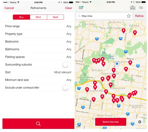 Source: Realestate.com.au
When designing the visual elements of an application, it is about building the look and feel. This includes the graphics, colour, styles, and layout. Things like the elements and principles of design as it applies to the user (Deragon, J. 2013). Some examples of best practice designs are included in Appendix 1 with emphasis on different functions.
Principle 2: Ockham’s Razor
This principle involves removing unnecessary elements from the design without compromising function. Lidwell noted in his book ‘Universal Principles of Design’, that this principle makes form follow function so that information or function is displayed, based on the need of the user, not the designer. Resist the Horror Vacui which is the desire to completely fill all available space (Lidwell, Holden & Butler, 2010, p.172).
The Google website today is a good example of keeping it simple maintaining its approach since very early on. Some initial versions of the site included additional unnecessary functions as depicted in the Figure 2 also demonstrating the designers urge to fill available space, however these were removed to be the familiar simple view.
Figure 2: Example of best practice (Google search desktop page)
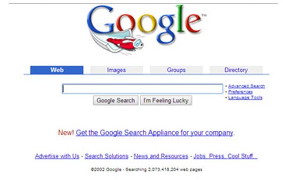 Source: https://www.google.com.au/
Another example is ANZ who applied the chunking and simple principles to create the award winning Banking application (Apple, Inc., n.d.). This has resulted in a highly used application that looks good and is easy to work for users with functions typical of users while away from a desktop.
Figure 2: Example of the best practice (ANZ banking)
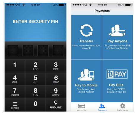
Source: https://itunes.apple.com/au/app/anz-gomoney-australia/id387076038?mt=8
The Instagram and TripAdviser applications, however, have also included a feedback loop to their simple design which enables users to share information and provide direct feedback to the poster in the form of a comment (Apple, Inc., n.d.).
Figure 3: Example of best practice (Instagram and TripAdviser)
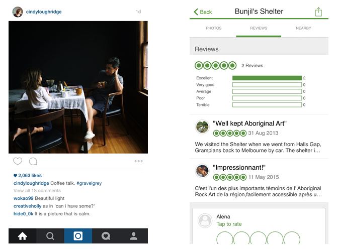 Source: Instagram.com.au and Tripadvisor.com.au
Principle 3: Mimicry
Mimicry is a useful principle that uses familiar objects (surface design) to improve usability (function design – solve mechanical and structural problems consider transfer and scaling effect) by enhance behavioural mimicry to improve likability (Lidwell, Holden & Butler, 2010, p.156). It assists and can be apply for complexity design. This principle is design on the idea that users use familiar icons and objects especially where is such a big demand on saving space. The example of the surface mimicry in the design of software icons and controls in the iTunes application (Apple, Inc., n.d.). Even those who are unfamiliar with the software can use it by simply relating to an icon.
Figure 4: Example of best practice (Apple iTunes)
Source: http://www.apple.com/itunes/
Identifying how and where best design is used (Skoolbag Application).
The ‘Skoolbag’ application included in Appendix 2 and depicted in Figure 5 below, includes simple iconic buttons and visuals to indicate what information lies ahead (Skoolbag n.d.). All these principles mentioned have been followed in this application as we can see that information has been organised in to groups, icons used (mimicry) which is recognisable and easily understood, information is grouped and the principle of Ockham’s razor has been followed making processes to use functions simple and easy to follow.
Figure 5: Example of best practice (Skoolbag)
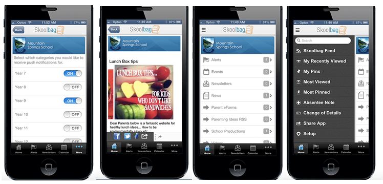 Source: http://skoolbag.com.au/whatis.php
Identifying how and where best design is used (Compass Application).
Doncaster Secondary College took the complexity design in a more structured and organized way, where school can create and control artificial environments (Stoltermam, 2008, p.59). The developers tried to reduce complexity, establish control, by making things simple, however it worked the other way around, because the other side of complexity brings positive values such as experiences of challenge, fullness, and entertainment, which can be considered as a desired quality. So, we can say that required condition for innovative and creative design is complexity.
There is a demand for essential information and connection for parents with the school and this is placed on to the compass website, but this information does not make it to the mobile application and it is harder to use with little value (The Active School Apps 2012).
Figure 6: The Chosen Design Example (‘Compass’)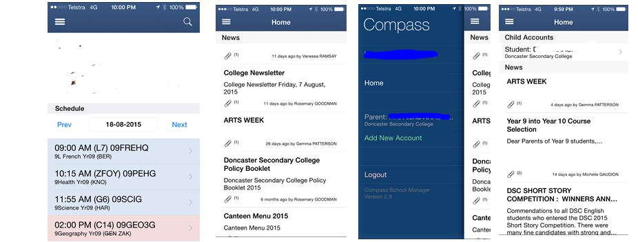 Source: https://doncastersc.vic.jdlf.com.au/login.aspx
Analysis of the chosen design
To conduct the analysis, we have to break down those steps into sections by answering these questions, this completed process is included in Appendix 4. The analysis demonstrates the design thinking process for ‘Compass’ had failed in all these domains:
- Empathy
- Integrative thinking
- Optimism
- Experimentation
- Collaboration
As an opposite example of the ‘Skoolbag’ application, ‘Compass’ is hard to read (excessive scrolling) and has not followed the layering principle. The application is disorganised with displaced text links and misuse of space (Layering), no icons (Mimicry) which could provide clearer directions and Ockham’s razor has been ignored with the overload of information. It actually serves two functions; to see your child’s timetable and read a long list of newsletter PDF links.
A process to arrange the analysis has been included in to the table in Appendix 3. This table has a series of questions that ensure appropriate consideration is given to each aspect of the design principles and processes. It also considers the valuable perspective of the user (in this case myself) as an important stakeholder.
Critique of the chosen design
The key focus of the end user in this case are the parents who typically require information a host of information. Table 1 below indicates a comparison of functions between the desktop and mobile platforms.
Table 1: Comparison of Functions – Desktop versus Mobile
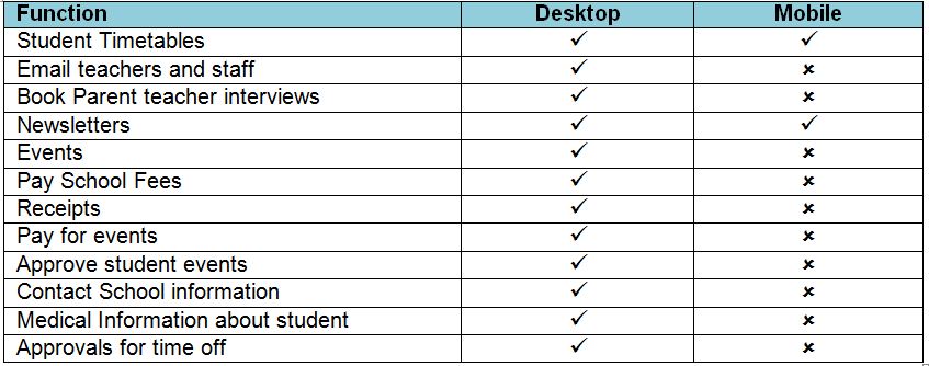 The functions made available via the mobile application do not address the needs of parents who would make considerable use from these on a mobile device. The school often seeks parents’ involvement in the school community, yet there is no function for parents to communicate with each other on these platforms.
The application is not intuitive with clear functions enabling a user to find their way through the application, resulting in a trial and error experience and there are no functions made available for any feedback on the application. Visually, the application appears as information that has been ‘made available’ through the mobile device, rather than designed for it. Fonts change in size for no apparent reason and text, such as header and body text, is placed in seemingly uncomfortable positions in context to other parts of the same information.
Conclusion
The definition of design in science that is the controlled experiment and has been used in the area of interaction usability (Stoltermam, 2008, p. 60). In science, it is the way to restrict and isolate variables that might influence the outcome of the experiment with the purpose to find a way of measuring the role of a small number of variables.
However, with the growing understanding of interaction which is a variable in the Compass application as an overall experience has to include all aspects of the design and its principles and practices and must focus on the parent’s activities. In order to achieve this the designer has to revisit the design steps which include research, ideally with the parents involved in the process.
References
Apple, Inc., n.d., iTunes Preview: iTunes, retrieved: 18th of August 2015, from: http://www.apple.com/au/itunes/
Apple, Inc., n.d., iTunes Preview: Instagram, retrieved: 18th of August 2015, from: https://itunes.apple.com/us/app/instagram/id389801252?mt=8
Apple, Inc., n.d., iTunes Preview: TripAdvisor Hotels Flights Restaurants, retrieved: 18th of August 2015, from:https://itunes.apple.com/us/app/tripadvisor-hotels-flights/id284876795?mt=8
Apple, Inc., n.d., iTunes Preview: ‘ANZ goMoney Australia’, retrieved: 18th of August 2015, from: https://itunes.apple.com/au/app/anz-gomoney-australia/id387076038?mt=8
Brown, T. 2009, “Designers think big”, Teds Talk, retrieved: 18th of August 2015, from: http://www.ted.com/talks/tim_brown_urges_designers_to_think_big?language=en
Deragon, J. 2013, Winning Proportions and Frictionless Navigation, [PowerPoint slides], retrieved: 18th of August 2015, from: https://speakerdeck.com/uxaustralia/winning-proportions-and-frictionless-navigation
Doncaster Secondary College n.d., Compass, retrieved: 18th of August 2015, from: https://doncastersc.vic.jdlf.com.au/login.aspx
Kyrnin, J. n.d., ‘What is design?’, AboutTech, retrieved: 18th of August 2015, from: http://webdesign.about.com/od/webdesign/qt/what-is-design.htm
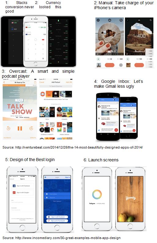
Laurinavicius, T. n.d., ‘30 Great Examples of Mobile App Design’, Incomdiary, retrieved: 18th of August 2015, from: http://www.incomediary.com/30-great-examples-mobile-app-design
Lidwell, W., Holden, K. & Butler, J. 2010, Universal Principles of Design, Rockport Publishers, Inc.
Newbury, B.E. n.d., What is design? [PowerPoint slides], retrieved: 20th of August 2015, from: https://ilearn.swin.edu.au/webapps/blackboard/content/listContent.jsp?course_id=_167505_1&content_id=_5284379_1
Stoltermam, E. 2008, ‘The nature of design practice and implication design research’, International Journal of Design, vol.2 (1), pp. 55-66, retrieved: 18th of August 2015, from: http://www.ijdesign.org/ojs/index.php/IJDesign/article/view/240/148
Skoolbag n.d., What is skoolbag?, retrieved: 18th of August 2015, from: http://skoolbag.com.au/whatis.php
The Active School Apps 2012, ‘Technology In Schools Moves Forward As Australian Schools Look To Mobile Apps To Improve Communication With Parents’, Active School Apps, retrieved: 18th of August 2015, from: http://www.activeschoolapps.com.au/category/school-apps/
Weber, H. 2014, ‘The 14 most beautifully designed apps of 2014’, Venturebeat, retrieved: 18th of August 2015, from: http://venturebeat.com/2014/12/28/the-14-most-beautifully-designed-apps-of-2014/
Appendix 1
The post Design Principles & Processes – within Educational Applications appeared first on The Digital Journal.
]]>The post CloudFlare Part 2 – Superfast CDN appeared first on The Digital Journal.
]]> As a follow up to the previous post on installing CloudFlare, the implementation was completed on our corporate site with some astonishing results. I must admit, I was skeptical, I was not sure it would really deliver the promise offered. Essentially, there are a lot of features they add for free, and you really can not help but wonder what is thier business model, how do they profit and what do they need to do. I was expecting a range of endless offers for upgrades, new features and such – all at a cost but nothing.
So the end result, the real reason for doing this was an improvement on the speed. We are using webpagetest.org and have been doing so since before the Cloudflare CDN implementation. So while there might be some reservations by others about the accuracy of that platform, and I suspect any platform will have its detractors and non-believers.
Table: Results following the CloudFlare CDN with full implementation of CloudFlare
 Table: Results before implementing the CDN CloudFlare
 The comparison between the two is almost not to be believed, The speeds we were getting before the implementation were terrible, there were complaints from everyone, users internally and externally as well. Some of the settings have not been fully enabled, for instance, we chose not to have the asynchonised loading of javascript, which there is a lot of embedded in to the homepage.
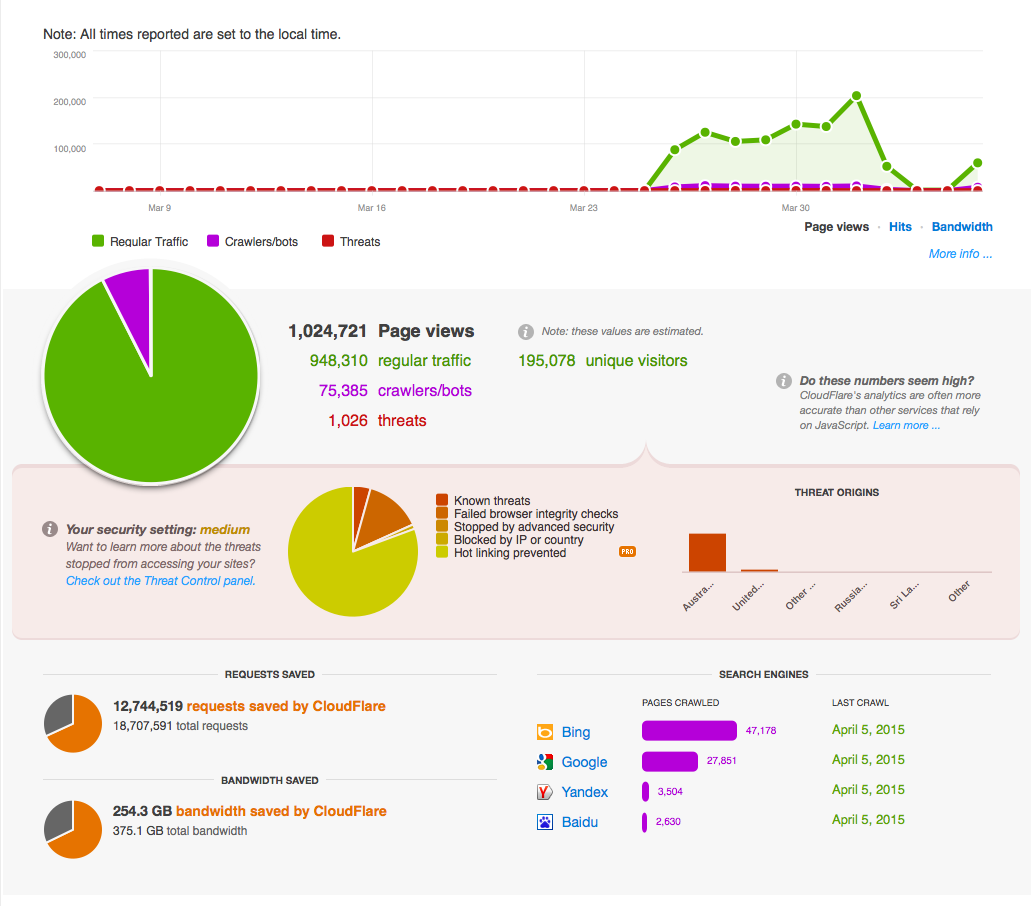
Overall, the CloudFlare CDN has saved 254 GB of bandwidth that our servers did not have to produce. In turn, our processors also did not have to work for. The suprise easter egg is the number of threats that the CloudFlare CDN has also blocked, what was also a surprise was that the threats were originating from Australian IP addresses. A full table of the results is included below.
The post CloudFlare Part 2 – Superfast CDN appeared first on The Digital Journal.
]]>The post Cloudflare – Boosting site performance with Cloud CDN appeared first on The Digital Journal.
]]>The Problem – slow site performance
For some time now, our corporate site has suffered some severe performance issues. Not just ordinary performance, we are talking a download time of around 60 seconds for just the homepage. Now while there are some other issues that include some coding, scripting and technical aspects which need to be addressed, there is also a further matter of the web content publishers that use the Content Management System. Both of these have adversely impacted the sites performance, and many times there has been a lot of blame placed upon the CMS itself from being too difficult to use, not intuitive and complicated but really it was about training. The practice of a more rigorous code review process also contributed to the matter, which is being addressed as well. Ultimately, a quick fix appeared to be the potential for a CDN to speed up the delivery of content.
What is a CDN?
A Cloud Delivery Network (CDN) is a system of servers around the world that are connected and that host your content for you. Its a way of providing alternative sources of distributing the content to users from various alternative high speed delivery servers. Mostly from a server that is closer to the user which adds to the speed of delivering the content. The CDN will make copies of the site and the site content and when a user requests content that is part of the CDN, the network will redirec the request to communicate with the cached content. The process is virtually transparent to the end user except for the speed of delivery which should become noticably faster.
There are a lot of CDN’s around these days, from from the very high end providers such as Akamai to the lower end ones, which have proven to be quite successful. In this case, at least for trials, we chose CloudFlare.com which gives a fantastic business account for just $200 per month. They offer some great free accounts as well for those of us who are simply blogging, but ultimately, this provided the best deal to go for some trials, get some stats and see what the difference was.
Watch the Video
Installing Cloudflare
On your simple website, the installation is a very simple process. By entering the URL of the site you want to add, simply click the Add Website button and the CloudFlare wizard will take over the rest searching the server for the various records that it will use to collect the appropriate content. When the records have been scanned, the wizard will ask you to continue.
 The wizard will present the user with the DNS records to be configured, this is not too daunting a task as there is already a recommended configuration provided. The real options are to choose what goes through the cloud network, versus what will bypass the cloud. For the more advanced, a zone file can be uploaded with a set of preconfigured records.
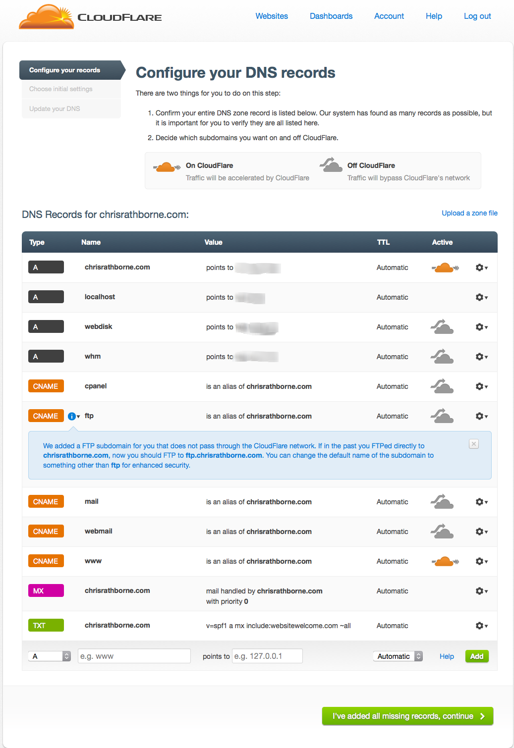 The final option is to set your plan and the configurations that are desired. For this site, I chose the free option and the full optimisation, whcih basically means that as much content as possible will be sent to the cloud. Security settings are something additional, and you can limit the countries that are accessing your website. Its easy enough to move to the business account which offers more support and some other options, but again, for this example the free option was selected.
 The final setting is to change your nameservers to redirect them from their current position to the cloudflare network. This is doen through the host of your nameserver (the company that hosts your internet address). This tells the traffic to be routed through the CloudFlare network rather than direct to your site host server.
Using a CNAME setup
One difference we had was to use the CNAME setup. This allowed us to modify our CNAME record to direct the traffic to the CloudFlare server rather than change the nsameservers. A key difference (and benefit), apart from the instant change, was that if we wanted to change the records back, we could change the CNAME record back and we would have instant roll-back. When changing NameServers, there can be a lag in the update of up to 48 hours and this method made the changes instant. This option was only available under the business account with CloudFlare.
Results
Overall, performance has improved impressively. The trial site we have implemented so far moved from around 27 seconds to load to less than 7 seconds. The final screenshot below indicates the performance of this site alone. The CloudFlare network has quite a few benefits, this is the free account and the performance speaks for itself.
The post Cloudflare – Boosting site performance with Cloud CDN appeared first on The Digital Journal.
]]>The post ‘Do Not Track’ gains momentum appeared first on The Digital Journal.
]]>The real momentum is now increasing as Apple, Mozilla and Microsoft have teamed up with privacy groups to really make a go of getting rid of this type of activity. Notably absent is Google from the list, which is understandable given the amount of revenue they stand to gain from the activity.
The world wide web (W3C) consortium has thrown its weight behind the initiative also, effectively overseing the group. They have published their minutes, which is a good read to help understand some of the insights in to the development of such things.
The post ‘Do Not Track’ gains momentum appeared first on The Digital Journal.
]]>The post Adword Remarketing – stalking !!! appeared first on The Digital Journal.
]]>
Seemingly a pretty quiet affair, the concept of adword remarketing has come up quite a bit lately. I can see many of the marketers wanting to do more and more of this and why wouldn’t they? Its a great concept if you want to flog some stuff. Google’s got an interesting definition of it on Google’s Ad Innovations page.
Remarketing lets you show ads to users who’ve previously visited your website as they browse the Web.
When you use remarketing, you’ll tag pages of your site that correspond to certain categories you want to promote. For example, you could add a “TV” tag on all of the pages where you sell televisions. You can then create an AdWords campaign to show highly relevant messages (such as ads displaying a special offer on TVs) to people who’ve visted these pages as they browse sites across the Google Display Network.
While the above might seem innocent, I mean its just another form of online display advertising, its the intrusive nature of this particular form that has caught so much attention. In simple terms, upon visiting a website, viewing content and leaving, you will continue to be shown advertisements from the brand you have visited as you go to other websites. By way of a practical example, you visit an insurance companies website to quickly check out some car insurance and grab a quick quote. While there, the site tags your browser with a cookie and as you move around the internet to other sites, perhaps even days later – you could be presented with more insurance advertising from that same insurer.
It seems simple enough, harmless – perhaps even helpful is the way some would suggest, but lets present another example. Say you walk into a car yard, you view the car you wanted to see and then leave. One of the sales staff decides to follow you and continues to do so for the next two days until you walk into another car yard. Realising you are still in the market for a car, the first car sales staff from the yard you previously visited presents themselves again with a copy of the deal you might have been looking at. Quite likely, most people would be horrorfied at the concept. But it is essentially the same thing.You can also navigate to this website to know more about how to overcome challenges that are involved in real estate marketing.
Who is Remarketing?
Many companies are now doing this as a part of their online strategy. Particularly organisations that rely on high volume traffic for their business for example, hotelliers, resorts and travel organisations. They are relying on the fact that you quite likely will do a lot of online shopping before you purchase and they want to be there all the time in case you might be ready to make a purchase.
How does it work?
The activities involve the placement of third party cookies onto the users machine, which in itself has become something of a furore among the digital community and the browser developers lead by Mozilla, but closely followed by the developers of Safari and Internet Explorer. They clearly despise the practice and are moving to default their browsers to deny such cookies.
The cookies provide a message back to google adwords letting them know what site you are visiting. Google makes the connection and basically will then present advertising content to you that matches both your history and your current site pages.
Overall, I believe this to be quite a scary concept, and personally it is another reason that I will be disabling cookies, blocking advertisements and such. Of course there are the necessary advertising, and in some cases the advertising is quite good and really is appropriate. These are the ones that you really do want to support and we should. Perhaps eventually it will all come full circle and decent, non-intrusive online advertising will make its way back through. Lets hope so, but in the meantime – what do you think?
The post Adword Remarketing – stalking !!! appeared first on The Digital Journal.
]]>