Introduction
Design is following us everywhere we go, it is embedded in to our everyday lives, and particularly the education system (Kyrnin, n.d.). There are many definitions of design however, summarising, Peter Gorb proposed that design is “a planning process for products or services that should satisfy the customer and business needs” as cited in Newbury presentation (Newbury, n.d., p.4).
A phrase made by Tim Brown in his presentation at Teds Talk was that designers need to change from “… design to design thinking …”. Design thinking approach involves using design principles to solve problems converging desirability, viability and feasibility. Design principles and processes should be used to address problems, make life easier and information more accessible and usable (Brown, 2009).
As a teaching student majoring in visual communications design and a parent who wants to be involved in my daughters’ education, I am exploring digital designs of mobile applications, specifically one called ‘Compass’. I am including analysis and critique of its adherence to design principles and processes, including the perspective of parents alongside other best practice examples.
Discussion
Sometimes the design application does not fit its purpose, because first we need to understand why we were doing something (Brown, 2009). It has to be human-centred, practical and simple to use. You can also read more about web designs and marketing designs here!
It has been argued by Rogers (Stoltermam, 2008, p.59) the potential success of new approaches or tools is possible to predict based on attention to the design and approach used. There are three factors of the final measure of success such as real use, revealed in location and over time.
In order to deal with complexity and “wicked problems” designers need to follow design principles and processes to achieve the best design outcome (Stoltermam, 2008, p.58). Lidwell, Holden and Butler discuss 125 ways to enhance usability, (Lidwell, Holden & Butler, 2010, p.12) this paper focuses on some of those.
Principle 1: Layering
This principle organises information into related groupings and then presents certain groupings at any one time (Lidwell, Holden & Butler, 2010, p.146). Layering helps to deal with highly complex information and reinforce relationships in information.
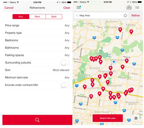
An example of layering within a mobile application is RealEstate.com.au see Figure 1 example, which presents information based on the users’ choice of Buy, Rent or Auction properties and these are provided to the user sorted by dates and locations of the auctions. Users can refine information based on choices they make.
Figure 1: Example of best practice (RealEstate.com.au)
 Source: Realestate.com.au
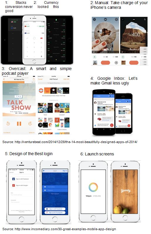
When designing the visual elements of an application, it is about building the look and feel. This includes the graphics, colour, styles, and layout. Things like the elements and principles of design as it applies to the user (Deragon, J. 2013). Some examples of best practice designs are included in Appendix 1 with emphasis on different functions.
Principle 2: Ockham’s Razor
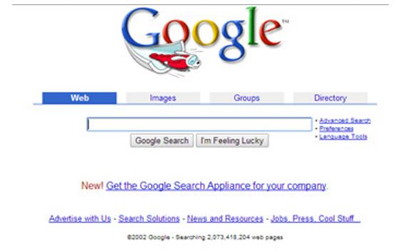
This principle involves removing unnecessary elements from the design without compromising function. Lidwell noted in his book ‘Universal Principles of Design’, that this principle makes form follow function so that information or function is displayed, based on the need of the user, not the designer. Resist the Horror Vacui which is the desire to completely fill all available space (Lidwell, Holden & Butler, 2010, p.172).
The Google website today is a good example of keeping it simple maintaining its approach since very early on. Some initial versions of the site included additional unnecessary functions as depicted in the Figure 2 also demonstrating the designers urge to fill available space, however these were removed to be the familiar simple view.
Figure 2: Example of best practice (Google search desktop page)
 Source: https://www.google.com.au/
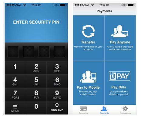
Another example is ANZ who applied the chunking and simple principles to create the award winning Banking application (Apple, Inc., n.d.). This has resulted in a highly used application that looks good and is easy to work for users with functions typical of users while away from a desktop.
Figure 2: Example of the best practice (ANZ banking)
Source: https://itunes.apple.com/au/app/anz-gomoney-australia/id387076038?mt=8
The Instagram and TripAdviser applications, however, have also included a feedback loop to their simple design which enables users to share information and provide direct feedback to the poster in the form of a comment (Apple, Inc., n.d.).
Figure 3: Example of best practice (Instagram and TripAdviser)
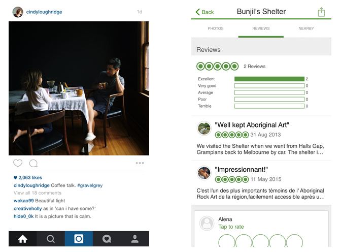 Source: Instagram.com.au and Tripadvisor.com.au
Principle 3: Mimicry
Mimicry is a useful principle that uses familiar objects (surface design) to improve usability (function design – solve mechanical and structural problems consider transfer and scaling effect) by enhance behavioural mimicry to improve likability (Lidwell, Holden & Butler, 2010, p.156). It assists and can be apply for complexity design. This principle is design on the idea that users use familiar icons and objects especially where is such a big demand on saving space. The example of the surface mimicry in the design of software icons and controls in the iTunes application (Apple, Inc., n.d.). Even those who are unfamiliar with the software can use it by simply relating to an icon.
Figure 4: Example of best practice (Apple iTunes)
Source: http://www.apple.com/itunes/
Identifying how and where best design is used (Skoolbag Application).
The ‘Skoolbag’ application included in Appendix 2 and depicted in Figure 5 below, includes simple iconic buttons and visuals to indicate what information lies ahead (Skoolbag n.d.). All these principles mentioned have been followed in this application as we can see that information has been organised in to groups, icons used (mimicry) which is recognisable and easily understood, information is grouped and the principle of Ockham’s razor has been followed making processes to use functions simple and easy to follow.
Figure 5: Example of best practice (Skoolbag)
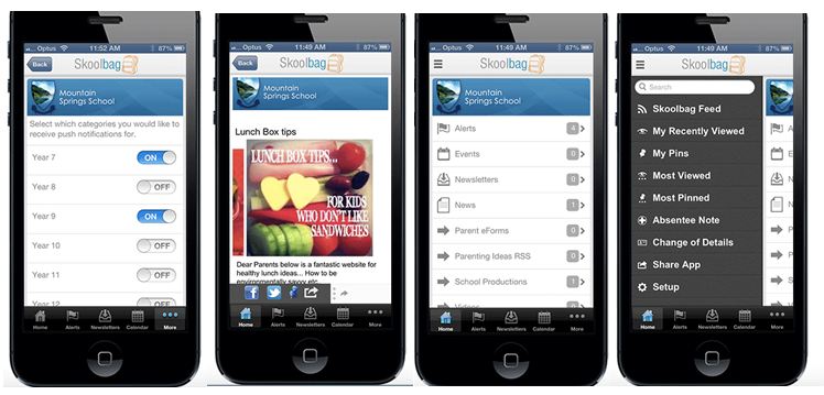 Source: http://skoolbag.com.au/whatis.php
Identifying how and where best design is used (Compass Application).
Doncaster Secondary College took the complexity design in a more structured and organized way, where school can create and control artificial environments (Stoltermam, 2008, p.59). The developers tried to reduce complexity, establish control, by making things simple, however it worked the other way around, because the other side of complexity brings positive values such as experiences of challenge, fullness, and entertainment, which can be considered as a desired quality. So, we can say that required condition for innovative and creative design is complexity.
There is a demand for essential information and connection for parents with the school and this is placed on to the compass website, but this information does not make it to the mobile application and it is harder to use with little value (The Active School Apps 2012).
Figure 6: The Chosen Design Example (‘Compass’)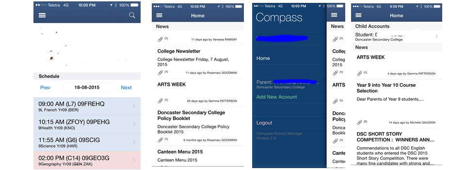 Source: https://doncastersc.vic.jdlf.com.au/login.aspx
Analysis of the chosen design
To conduct the analysis, we have to break down those steps into sections by answering these questions, this completed process is included in Appendix 4. The analysis demonstrates the design thinking process for ‘Compass’ had failed in all these domains:
- Empathy
- Integrative thinking
- Optimism
- Experimentation
- Collaboration
As an opposite example of the ‘Skoolbag’ application, ‘Compass’ is hard to read (excessive scrolling) and has not followed the layering principle. The application is disorganised with displaced text links and misuse of space (Layering), no icons (Mimicry) which could provide clearer directions and Ockham’s razor has been ignored with the overload of information. It actually serves two functions; to see your child’s timetable and read a long list of newsletter PDF links.
A process to arrange the analysis has been included in to the table in Appendix 3. This table has a series of questions that ensure appropriate consideration is given to each aspect of the design principles and processes. It also considers the valuable perspective of the user (in this case myself) as an important stakeholder.
Critique of the chosen design
The key focus of the end user in this case are the parents who typically require information a host of information. Table 1 below indicates a comparison of functions between the desktop and mobile platforms.
Table 1: Comparison of Functions – Desktop versus Mobile
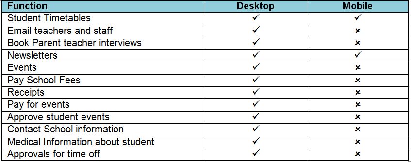 The functions made available via the mobile application do not address the needs of parents who would make considerable use from these on a mobile device. The school often seeks parents’ involvement in the school community, yet there is no function for parents to communicate with each other on these platforms.
The application is not intuitive with clear functions enabling a user to find their way through the application, resulting in a trial and error experience and there are no functions made available for any feedback on the application. Visually, the application appears as information that has been ‘made available’ through the mobile device, rather than designed for it. Fonts change in size for no apparent reason and text, such as header and body text, is placed in seemingly uncomfortable positions in context to other parts of the same information.
Conclusion
The definition of design in science that is the controlled experiment and has been used in the area of interaction usability (Stoltermam, 2008, p. 60). In science, it is the way to restrict and isolate variables that might influence the outcome of the experiment with the purpose to find a way of measuring the role of a small number of variables.
However, with the growing understanding of interaction which is a variable in the Compass application as an overall experience has to include all aspects of the design and its principles and practices and must focus on the parent’s activities. In order to achieve this the designer has to revisit the design steps which include research, ideally with the parents involved in the process.
References
Apple, Inc., n.d., iTunes Preview: iTunes, retrieved: 18th of August 2015, from: http://www.apple.com/au/itunes/
Apple, Inc., n.d., iTunes Preview: Instagram, retrieved: 18th of August 2015, from: https://itunes.apple.com/us/app/instagram/id389801252?mt=8
Apple, Inc., n.d., iTunes Preview: TripAdvisor Hotels Flights Restaurants, retrieved: 18th of August 2015, from:https://itunes.apple.com/us/app/tripadvisor-hotels-flights/id284876795?mt=8
Apple, Inc., n.d., iTunes Preview: ‘ANZ goMoney Australia’, retrieved: 18th of August 2015, from: https://itunes.apple.com/au/app/anz-gomoney-australia/id387076038?mt=8
Brown, T. 2009, “Designers think big”, Teds Talk, retrieved: 18th of August 2015, from: http://www.ted.com/talks/tim_brown_urges_designers_to_think_big?language=en
Deragon, J. 2013, Winning Proportions and Frictionless Navigation, [PowerPoint slides], retrieved: 18th of August 2015, from: https://speakerdeck.com/uxaustralia/winning-proportions-and-frictionless-navigation
Doncaster Secondary College n.d., Compass, retrieved: 18th of August 2015, from: https://doncastersc.vic.jdlf.com.au/login.aspx
Kyrnin, J. n.d., ‘What is design?’, AboutTech, retrieved: 18th of August 2015, from: http://webdesign.about.com/od/webdesign/qt/what-is-design.htm
Laurinavicius, T. n.d., ‘30 Great Examples of Mobile App Design’, Incomdiary, retrieved: 18th of August 2015, from: http://www.incomediary.com/30-great-examples-mobile-app-design
Lidwell, W., Holden, K. & Butler, J. 2010, Universal Principles of Design, Rockport Publishers, Inc.
Newbury, B.E. n.d., What is design? [PowerPoint slides], retrieved: 20th of August 2015, from: https://ilearn.swin.edu.au/webapps/blackboard/content/listContent.jsp?course_id=_167505_1&content_id=_5284379_1
Stoltermam, E. 2008, ‘The nature of design practice and implication design research’, International Journal of Design, vol.2 (1), pp. 55-66, retrieved: 18th of August 2015, from: http://www.ijdesign.org/ojs/index.php/IJDesign/article/view/240/148
Skoolbag n.d., What is skoolbag?, retrieved: 18th of August 2015, from: http://skoolbag.com.au/whatis.php
The Active School Apps 2012, ‘Technology In Schools Moves Forward As Australian Schools Look To Mobile Apps To Improve Communication With Parents’, Active School Apps, retrieved: 18th of August 2015, from: http://www.activeschoolapps.com.au/category/school-apps/
Weber, H. 2014, ‘The 14 most beautifully designed apps of 2014’, Venturebeat, retrieved: 18th of August 2015, from: http://venturebeat.com/2014/12/28/the-14-most-beautifully-designed-apps-of-2014/
Appendix 1